Что мы делали по проекту
Before starting the work, we conducted an audit of the site. The audit showed a lot of interesting points and we were able to justify why the site can not be promoted in this form. And if you do – then the effectiveness of the work may be low:
- The site was improperly optimized. It had an incomprehensible structure with many sections and subsections, and not all sections were displayed on the site in the menu;
- The site was found by the words inappropriate topics;
- Duplicate services and texts on them;
- Content was not updated regularly and was not unique;
- The appearance was not attractive and the use of the site was uncomfortable.
Because of this, the client was originally proposed to restart the site, and then look at the result of the work in the context of indexing and traffic, and then move on to seo-promotion.
Order of work:
Collecting the semantic core and developing the structure of the site.
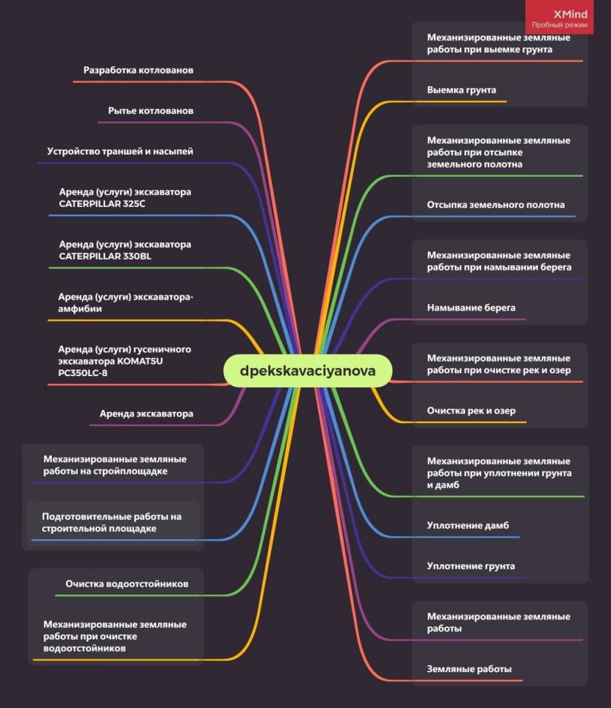
After the initial analysis, when it turned out that the site was in the search for irrelevant queries, services, categories duplicated each other and did not provide useful information. Both for users and for the search engine.
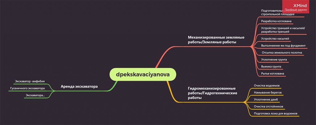
It was necessary to develop a new structure of the site. We collected keywords. They turned out to be about 600 pieces, coordinated and presented the new site tree – pages, categories, list of services.
Old site structure:
Новая структура сайта:
Domain change.
The old domain name was hard to remember, hard to pronounce, and very difficult to write in a browser. We needed something simple, consonant with the theme or name of the company. When choosing a new site name, we took into account domain selection tips.
We got this result – dpekskavaciyanova.com стала dnepr-nova.com.ua. It’s quick and easy.
Writing texts
For the right requests we have written and placed texts, correctly placed meta tags, alt attributes on images.
The total volume of texts on services and categories of services reached – 20,000 characters without spaces.
After placing the texts were removed from the keyword positions, so that in a month or two to monitor their growth or decline.
html layout
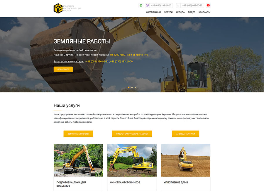
The last thing we did was a new layout. Initially the site was made on a small budget, and therefore the appearance left much to be desired. It was uncomfortable neither on mobile nor on the desktop. A new layout with clickable phone numbers, email, a convenient menu – including on cell phone – was made on the basis of the ready template for the site. Google analytics and a heat map were installed on the site.
Now the site is ready not only for seo-promotion, but also to run on it paid advertising from Google or Facebook.
Какой результат получили
Old design:
New design:


