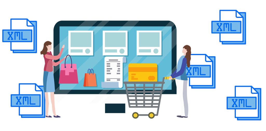
The purpose of the site to sell, and the purpose of the marketer and site developers to implement such improvements to the site was not only more traffic, but also to increase the conversion – the conversion of site visitors into buyers.
If the point of the site is communication with the client, then we must make this communication the most effective, give so much information that the visitor has no questions, he found the right product and bought it. That is, the potential client has no questions.
Making the filter on product categories more informative
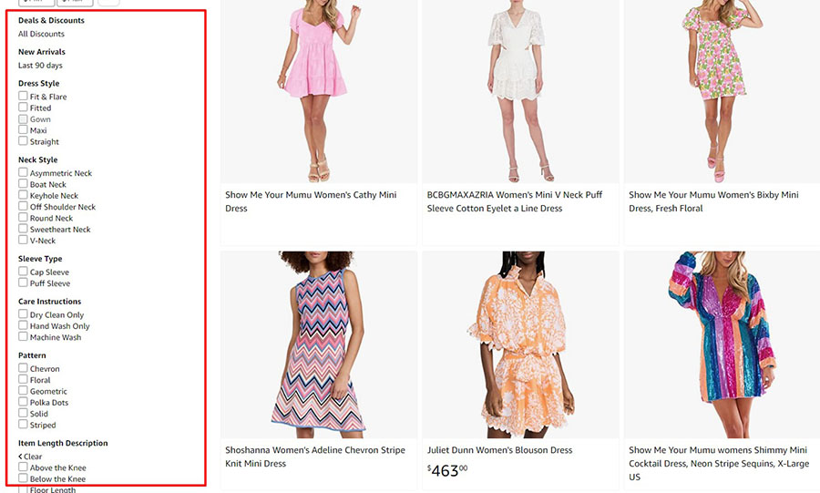
As a rule, on the category page, where the product listing is displayed, a filter is placed for quick search of tedious products according to the parameters set by the user.
The filter displays groups. These are the names of the attributes attached to the product, and under the name are the attribute values. If the user is looking for a product according to the parameters he wants, the filter will help him show only the product cards he wants, and he won’t have to search the whole page.
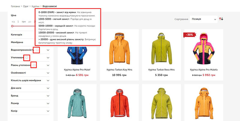
But there is a situation when the filter displays an incomprehensible attribute name, which is incomprehensible to the user. This happens when the product is very specific and the site sells goods for professionals.
There is a high probability that such an attribute will not be searched for and the user will leave the site without finding the product he wants.
We propose to introduce such a feature, as a tooltip. Tooltip looks like any symbol (which will attract the user’s attention), and when you hover your mouse over it, it will open a text with a description (explanation).
Such a refinement is very easy to implement on the site. For any CMS, whether it’s WordPress, OpenCart, Prestashop and so on. On the page for editing an attribute or group of attributes creates an additional field in which the text will be inserted. Preferably, there should be an editor and an opportunity to create headings, lists, paragraphs – to edit text and make it readable and structured for a live person.
And then display the contents of this field on the front next to the characteristic in the filter. Also don’t forget that if the site is in several languages, the content of the field should be translated into those languages.
Such a refinement can be scaled and output “hint” not only in the filter on the category page of the online store, but also on the page of a single product – in the section where the characteristics are displayed.
Thus we make the site not only user-friendly but also as informative as possible. Such refinement will help to increase sales and pay off for the owner.